Website Search Revamp
Increasing an EdTech company’s search result engagement by 20%
Project Info
8 Weeks
Professional Project
Team
UX Designer
Product Manager
Dev team (5 Devs, 2 QAs)
Focus
Search user experience
Desktop and mobile design
Agile methodology
Context
Simplilearn is a global EdTech company offering online certification programs, free courses, and learning resources to millions of users worldwide.
This professional project focused on revamping Simplilearn’s website search experience to help users discover relevant programs and free resources more effectively.
I worked as the UX Designer, owning the end-to-end experience across research, design audits, ideation, wireframing, prototyping, and final UI, for both desktop and mobile.
Problem
Although 200,000+ users use Simplilearn’s search feature every month,
only 10% of them click on a program or free resource.
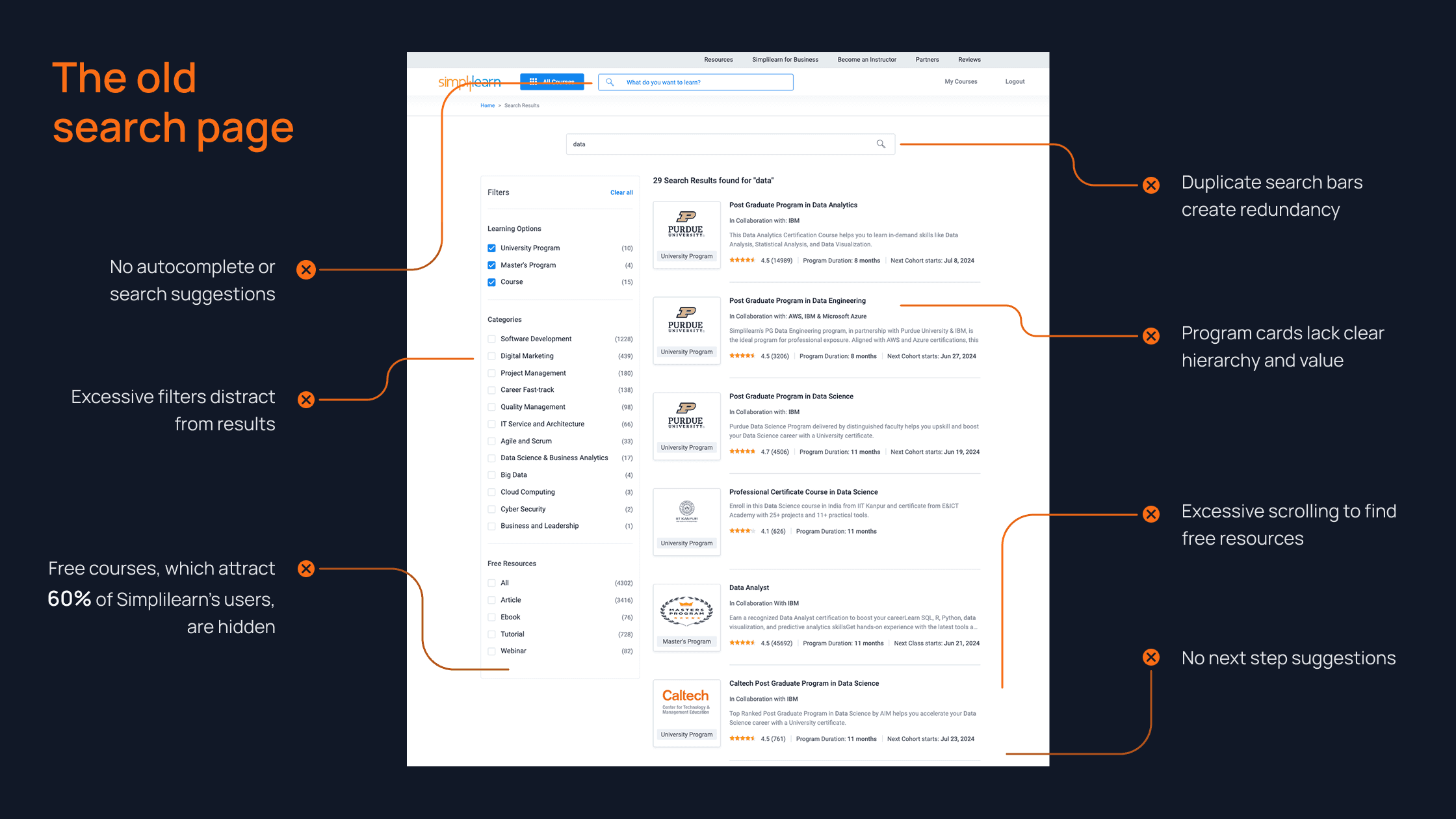
Causing 90% of users to drop off without taking any action.
Solution
A redesigned search experience with:
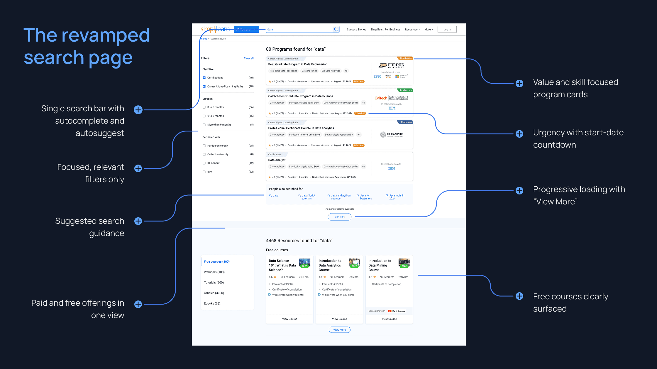
Leading to a 20% increase in clicks on programs and resources within the first month of release.
Research
Methods:
Design audit of the existing search experience
Behavioral analysis using heatmaps and engagement data
Benchmarking EdTech competitors’ search experiences
Desktop
And
Mobile
Heatmaps
Most activity
Search bars
Filters
Least activity
Program cards
Footer links
visuals adapted to respect confidentiality
Using heatmaps to understand engagement patterns
Insights
Users lacked guidance while searching
Too many filters diluted attention from results
Lack of urgency and value propositions
Free resources absent despite high demand
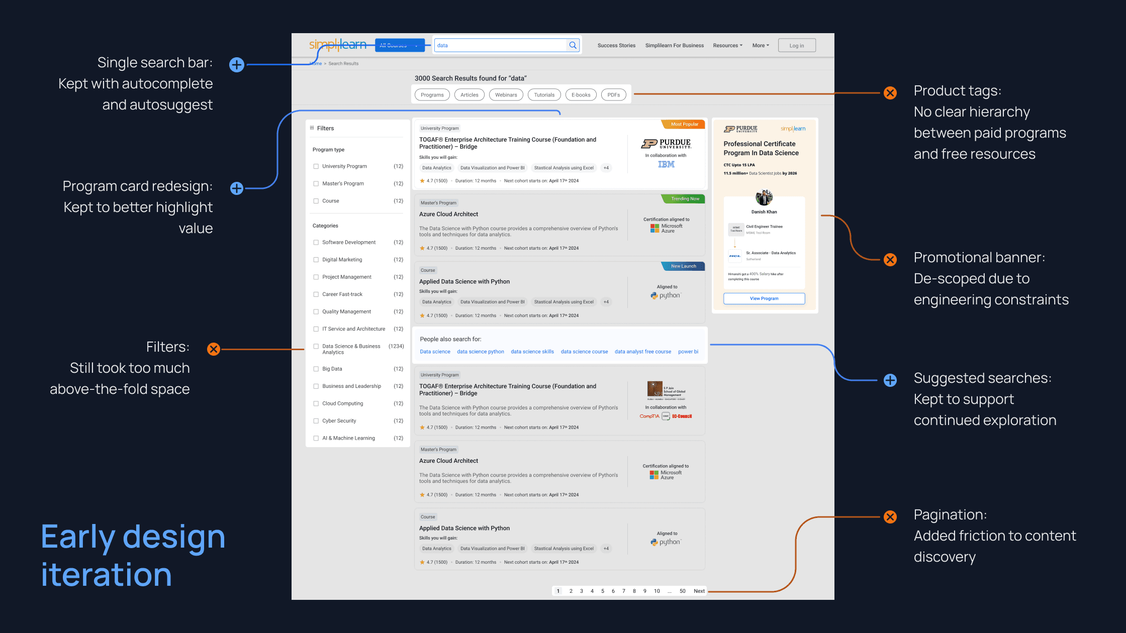
Ideation and Prototyping
Based on discussions with leadership and the engineering team, I decided to prioritize the following areas for this redesign effort:
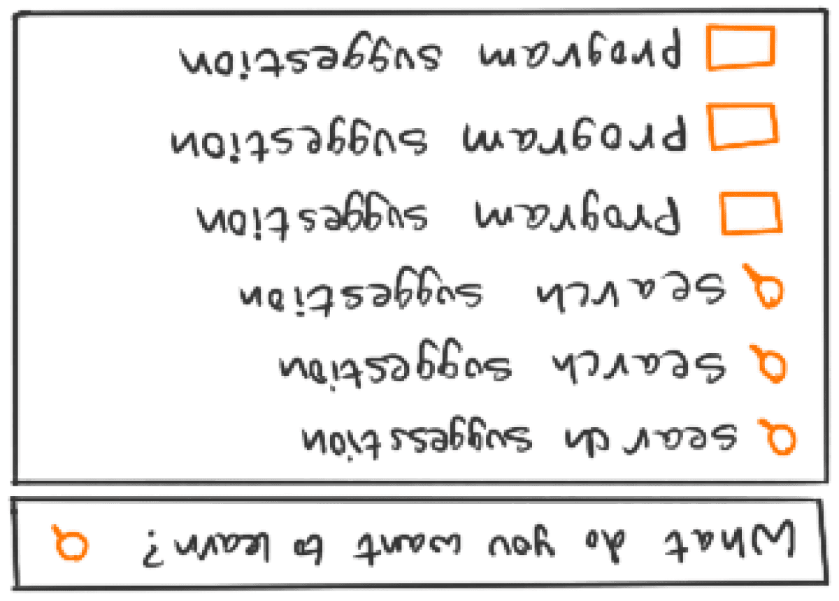
Guided search bar experience with keyword and program suggestions
New search results page with both paid programs and free resources
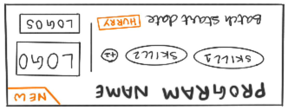
New program cards with highlighted skills, logos, and start dates
In addition to these three key design directions, an early iteration also included product tags and a promotional banner, which were later descoped.
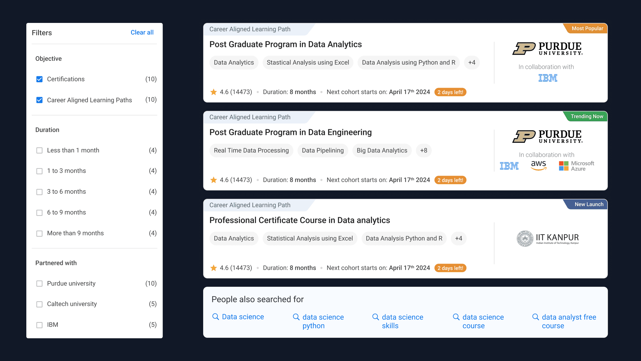
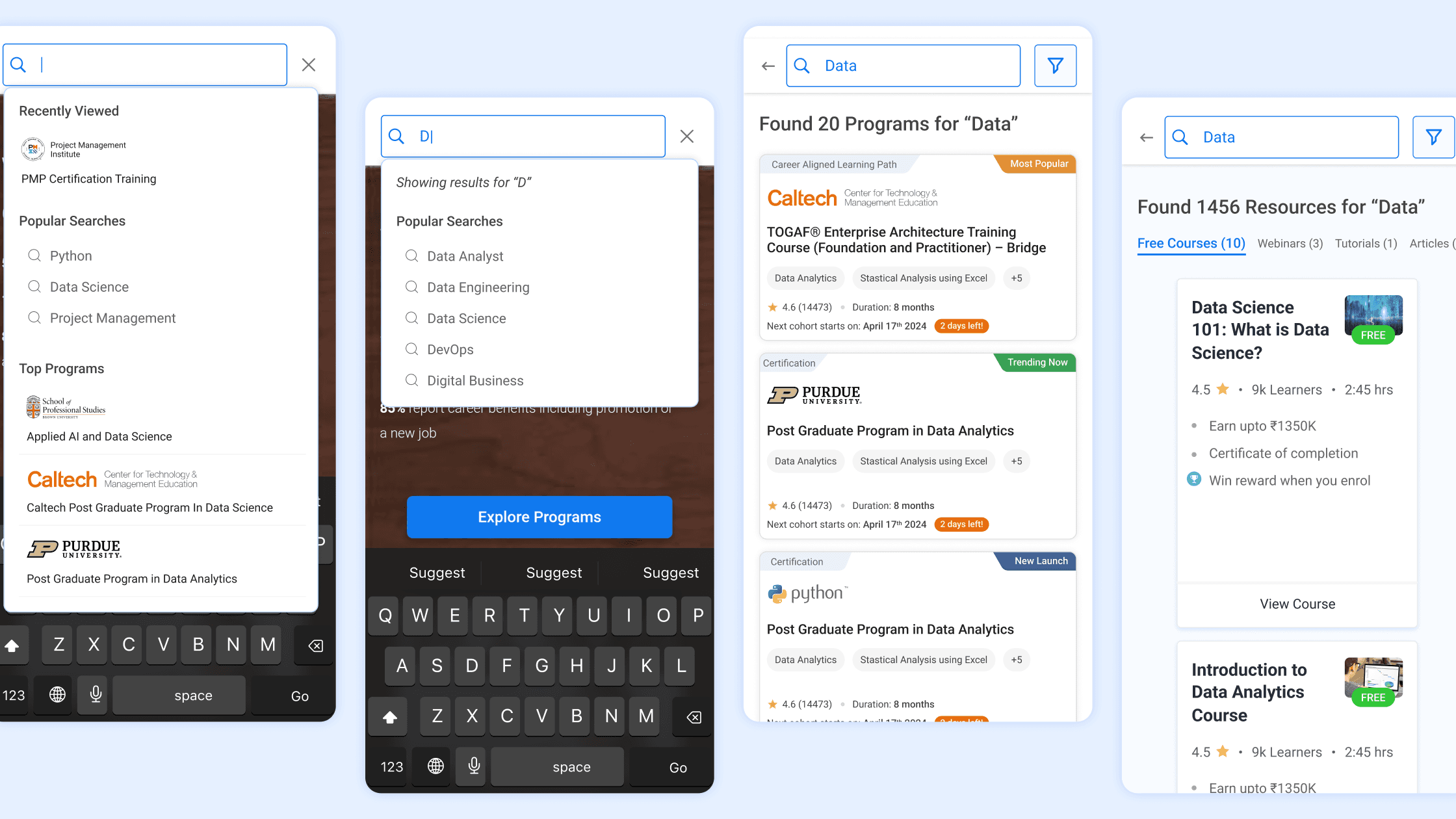
Final Design
This feature is live on
Search bar interaction
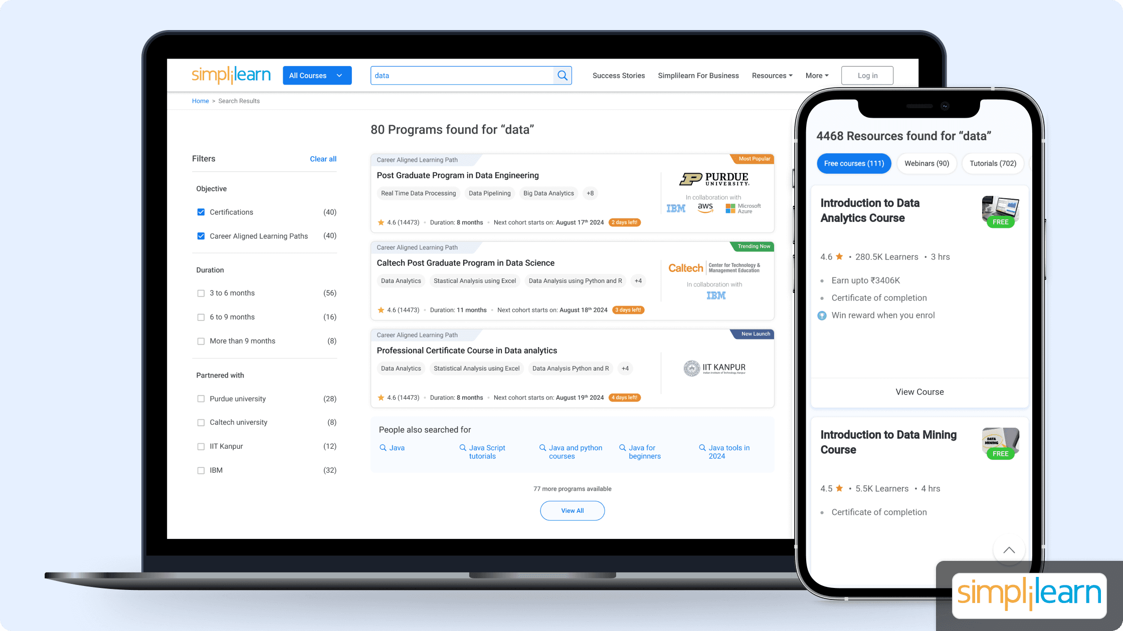
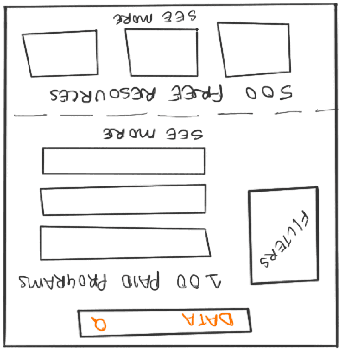
Search results
Paid programs take the top half, free courses and resources follow.
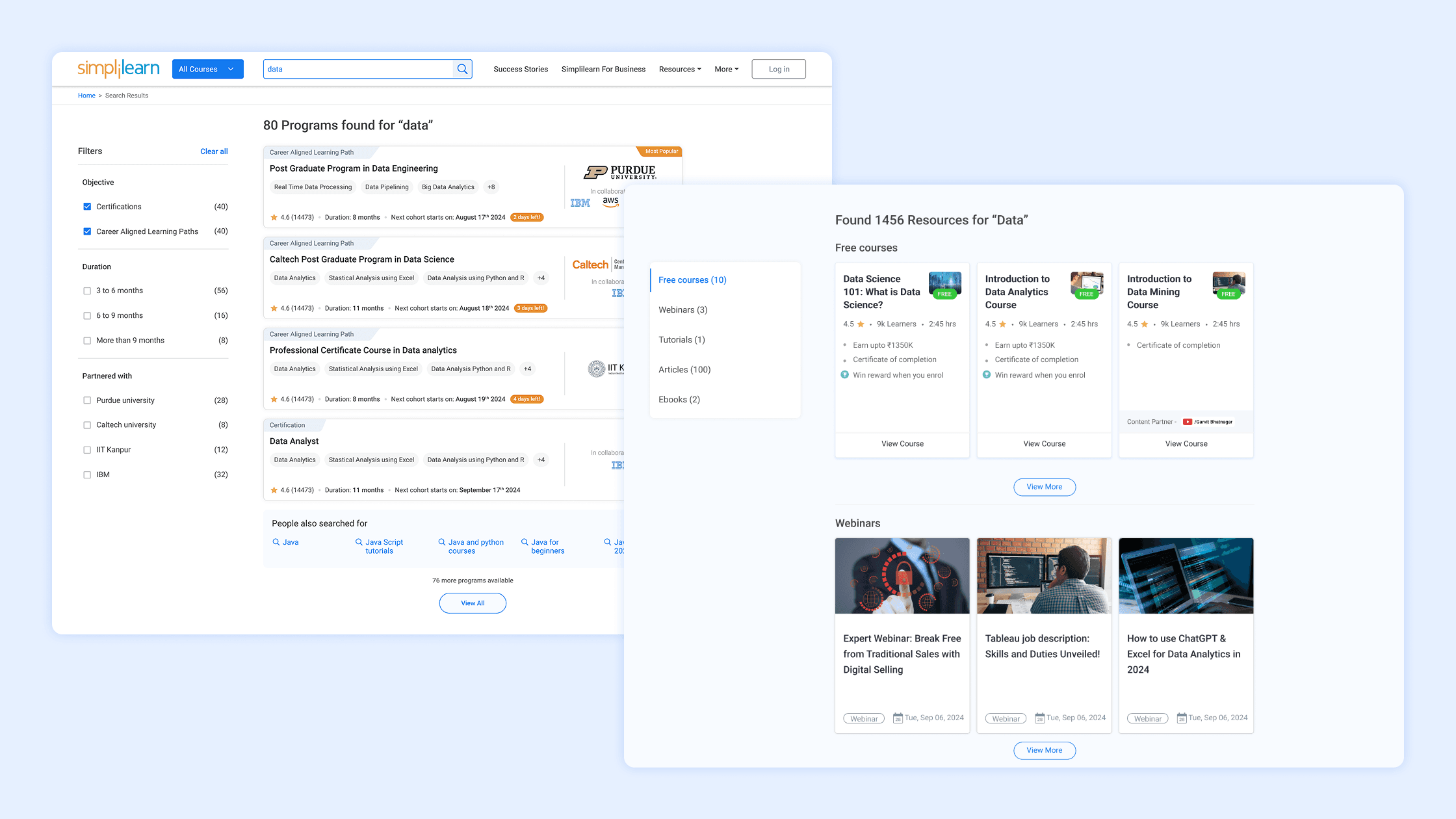
Program cards, filters, and suggested search guides
Program cards and suggested search guides for urgency, value proposition, and next steps. Slim filter panel with only most used filters.
Mobile experience
Reflections
Through this project, I learned how seemingly small changes in visual hierarchy, content grouping, and guidance cues can have a measurable impact on user engagement. Working in an EdTech context also highlighted the importance of balancing business metrics with user trust, especially when paid programs and free learning resources coexist. If I were to extend this project, I would focus on deeper personalization by leveraging past searches and behaviour, and explore AI-driven discovery for more relevant and long-term learning paths.

